themap.ai
(takes 1 min to load)
Getting the gist of an ethereum address can take a while: scan an address’s history, click on ERC20 token contracts that appear, checkout the transactees, and do the same to their history. We’ve confirmed countless times that two 42 character Ethereum addresses on different pages were indeed identical. Or how about navigating a trail of addresses hoping to learn something tangible at the end?
Comprehending communities on-chain is not easy, either. Search for a token contract, scroll down, click a wallet address, view the wallet history, go back to the project contract, click another wallet address, look at its history, and so on.
We are looking at a lot of SQL query results.
Addresses that trade similar tokens, and interact with similar dApps/contracts have similar behavior. The Map is a flat view of ETH addresses, where addresses that behave similarly on-chain are placed together for easy discovery.
The Map makes finding address intuitive and scalable.
Using The Map
Using The Map is like viewing neighborhoods and finding a destination on navigation systems. We are searching for addresses after all.
The search bar returns ENS domain names if they match your query. But ‘0x…’ addresses are valid queries too. Don’t search single letters or ‘0x’, it’ll crash the app.
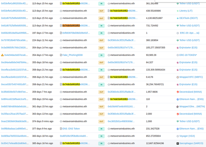
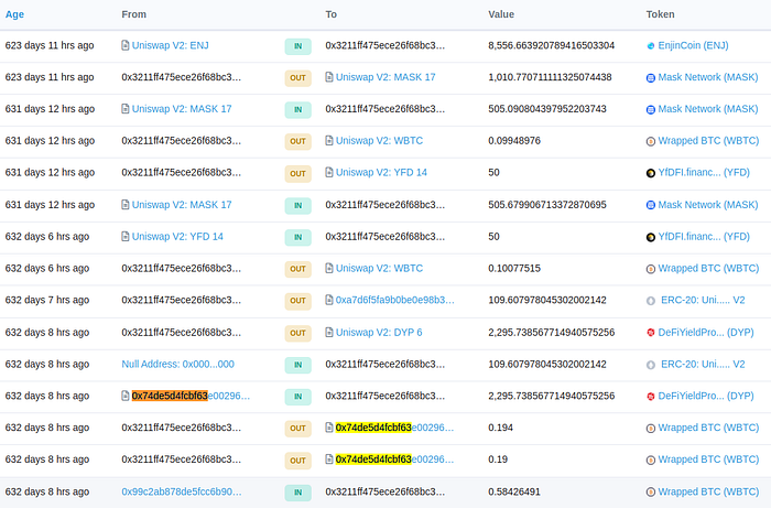
If we look at the history of metaverseindustries.eth and its neighbor ( 0x3211fF475eCE26F68Bc3922A669289192D6baA65 ), similarities are not immediately apparent. The Map put them close probably because 1) they both traded wrapped BTC, WETH, and tether. One has traded Enjinstarter and the other traded EnjinCoin 2) they both used the AirSwap Deployer 3 contract ( 0x74de5d4FCbf63E00296fd95d33236B9794016631 ). So despite differences like holding different ERC20 tokens, they share similar things.


metaverseindustries.eth is colored blue. That means it is in the top 5% of hodlers. An address is red if its net worth is in the top 5%, and green if its number of transactions is in the top 5%. And neon-ish green if the address user is in the top 5% by SAT score. Darker addresses are ENS holders; the domain name is displayed instead of the resolved address.
Below the search bar, the multi-layer gray icon leads to toggle options for different layers corresponding to these colors.
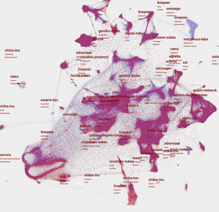
Zooming out from metaverseindustries, it’s marked as a small red circle in a big address region labeled ‘Shiba-inu’. A maroon polygon is fitted to a region to distinguish it easier.

The most popular token within a region, relative to all ETH addresses, is displayed as the maroon label. The 2nd and 3rd most popular tokens are listed below that. Example above shows a couple regions where Shiba-Inu and Leash tokens are most prevalent.
To view a token on CoinGecko, use https://www.coingecko.com/en/coins/[maroon label]
At the time of writing, The Map is V0.2. Only ETH addresses with more than 20 transactions are considered. Out of those 11.5 million possible ETH addresses, 223,000 are loaded into The Map. We are working on scaling to all addresses. Moreover, the snapshot of on-chain activity was dated to October 3rd 2022; transactions and other developments after this snapshot date are not reflected. What things look like around 1 million addresses:

For calculating popular tokens, some are so prevalent everywhere that they are skipped: ETH, tether, WETH, wrapped bitcoin, and Chainlink.
A Map of Ethereum
Ethereum. The protocol where fortunes are made and lost.
Ethereum communities have more OGs, innovators, capital, artists and degens than any other. So a map of Ethereum naturally has all kinds of participants, including NFT collectors, dApp addresses, bots, exchange wallets, Inu millionaires, and ordinary users.
Let’s look at structure in the layout of addresses.
*A region can be quite big. Wallets sampled for wallet analysis below are picked from a narrow subsection; analysis may not portray the region generally.
High Networth Compound. One particular region in the north east has an abnormal majority of 95-th percentile addresses in networth and number of transactions. Members of this cohort show there are lots of ways to become high networth: stacking WETH, small cap DeFi tokens with a name like “xxx.finance”, and NFTs (south-most cluster, and 2 lower right clusters).
On closer examination of the western cluster, a lot of members are DeFi participants. Most projects held in these wallets are dApps with staking mechanism, or governance tokens that are stake-able. If this is true, it makes sense that this island is high networth and full of hodlers.
Again, if addresses are in the same region, they transacted similar assets, and dealt with similar dApps / contracts. Similar behavior makes The Map cluster them together.
A DeFi cluster
Another type of DeFi participants is found near the center of the Map. A cluster is outlined below. These wallets hold Chainlink, Uniswap, Aave, and utility tokens in the top 100. Wallets here do not have assets that result from interactions with staking contracts, leading to a different flavor of DeFi usage.
USDT addresses.
Some regions have use-case specific addresses. All wallets in the area below, for example, only deal with USDT (due to the prevalence of USDT transactions in the ETH ecosystem, we ignored it as a possible label. ‘huobi-token’ is the 2nd largest asset).
Wallets trade USDT most of the time.
Inu Token Communities
There is a lot of regions where the Shiba-Inu token reigns as the most popular. However, THIS island is for the Inu token communities
Wallets typically look like
NFT communities
From our past experience working with v0.1, there were also regions corresponding to dedicated NFT communities. Think wallets working with erc20 tokens like SOS, APE, LooksRare, and Flow. We leave that for the reader to discover.
FAQ
What’s Next for The Map?
Be helpful by showing up-to-date data for all addresses >20 transactions. Integrate The Map with other Web3 apps.
Treat NFTs right by accounting for wallets’ NFT ownership in The Map, and make NFTs accessible under each wallet.
How is The Map built?
The layout is decided by a neural network. The Map is how our trained neural network reasons about addresses within the blockchain protocol, i.e. we are viewing the neural network’s embedding of addresses. The x and y axis of the map have no meaning — moving in a direction, say east of a point, is meaningful relative to that point.
The yellow jellybean is the address embedding. A neural network converts ETH addresses into coordinates within this jellybean. The high dimensional jellybean is then squashed into a 2D plane, creating The Map.
Machine learning has a bias for shape rotators.
